

From the earliest cave paintings to medieval tapestries, human history has been told just as much through pictures as with words. This is just as true in business, where the right visualization is important to convey information effectively. And with the rise of Big Data, industries want to uncover meaningful value from all the information they gather. Enter data visualization, the charts and graphs that tell the story of data.
No longer is it just statisticians and analysts poring over data to uncover patterns. There is a growing need at all levels, from executives to junior associates, to answer business questions and address business needs via data quickly and efficiently. This often means self-service data mining.
And the amount of data coming in is breathtaking. In 2017, research from Domo deduced that 90 percent of the total data that exists today originated in the previous two years, which per day is about 2.5 quintillion bytes of data. Additionally, the variety and types of data have grown, and are arriving faster than ever, ushering in a need for data visualization techniques that will allow companies to extract value from the data so that, ultimately, they grow profitability due to new data-driven insights.
John Tukey, one of the first visionaries behind data visualization, said, “The greatest value of a picture is when it forces us to notice what we never expected to see.” This is where the power of visualizing data comes to fruition.
Types of data visualization
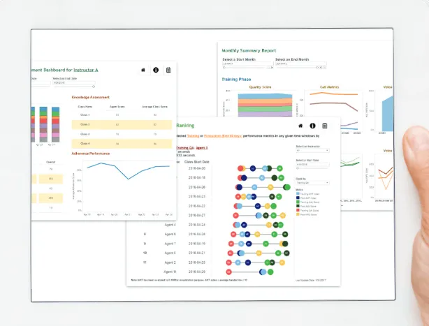
Data visualization can be shown through a plethora of representations, from charts and graphs to formal reports. Dashboard reporting is quickly becoming one of the most popular ways to visualize data (see Figure 1). The interactive dashboards can be created with several kinds of software, from Tableau to the more traditional PowerPoint. Dashboards typically integrate a number of data sources and can follow information over time, revealing trends or patterns otherwise hidden in spreadsheets or databases.
Infographics are another popular way to highlight a one-time snapshot of information, combining data and design to tell a story with numbers. Using charts, timelines, maps, and other visualization techniques, the graphics collaborate with the metrics to make the story pop out or paint a picture of the situation.
These are just two examples of data visualization used to communicate data to constituents from the business side who may not be involved in analysis or review of the actual statistics. Their ability to review the data in a way they can understand is crucial, since they may be able to identify issues or opportunities beyond what the data analysts are looking for.
Make the invisible visible
The power of visualization is that it uncovers patterns or relationships that may not be as obvious by looking only at numbers and statistics. With the vast amounts of data being analyzed, analysts can easily miss something important when poring over reams of data. Further, your eye can see relationships and differences faster in a visualization that when looking over tables of numbers.
For example, we once worked with a client who thought that small retailers and professional services firms used one of its products. All the pictures in its creative pieces mirrored these two audiences. A customer survey revealed, however, that half of its customers were individuals who worked from home selling items over the internet. It was only once we started putting the data into charts that we realized how wrong the client was about its core customers. The segment visualization made it easier to communicate this finding to the creative team so it could make changes to its materials.
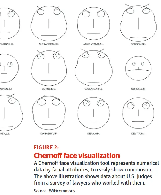
We also employ a visualization technique called “Chernoff faces” to evaluate differences among cluster segments. Instead of looking at many numbers to understand the difference between multiple clusters, each profile attribute is a characteristic of a face: the eye size, curve of the mouth, etc. The attributes vary in their shape, size, placement, and orientation on each segment’s face. Viewers can easily compare faces to see how segments differ by those variables (see Figure 2).
Many of our analysts have switched from running binary frequency distributions in SAS to displaying data visually in client meetings. The visualizations make it easier and faster to do exploratory data analysis, as well as to answer questions on the fly during meetings or brainstorm sessions. For instance, we worked with a client who was convinced that there was a particular segment of its customer base that was more likely to buy a particular product. We created a visualization during a meeting and showed the team that this was not true based on their data. There is power in being able to run scenarios and test out theories in real time in a meeting.
The need for self service, and caution
Once data has been visualized, a prime opportunity is its ability to help executives and others find meaningful results themselves from the data. This democratization enables someone who hasn’t been trained as an analyst to ask and answer business questions themselves so that they can better manage their piece of the business.
Self-service opportunities empower people throughout an organization to make changes to improve the business based on data-driven insights. By distributing data throughout the organization, individuals can act quickly to fix problems or take advantage of opportunities.
However, it’s easy to send the wrong message with visualization. Companies may misrepresent data by not providing context, omitting information, or visually confusing the viewer.
Analysts can cherry pick points of data to represent their findings incorrectly or disproportionately. Businesses can lie or misinterpret data by not providing context that may otherwise undermine or underwhelm their findings. Ask yourself, is the timeline too far or close apart, is it too vague, or are the variables too general?
Altering the axis on charts can also make a significant difference in how your findings look, either making a statistic look drastically larger or smaller. Yes, the numbers on all sides may be correct, but it is unethical to misrepresent the finding. Remember, if data visualization can dispel customer myths, unethical treatment can help create false tales.
Uncover hidden insights
It’s essential to talk to those who will view the visualized data to make sure that whatever is provided meets their needs. You must know what the stakeholders want, their objectives, and how they are really going to use the metrics you give them. Whatever data visualization tool you use needs to be visually stimulating enough to bring them in and practical enough for them to use and understand.
Providing an excellent visualization for your data is an iterative process and you may not get it right initially. Ultimately recognizing the need for a simpler and more effective presentation makes your brand an enabler not a hindrance.